How to Boost Sales by Building Trust in eCommerce Product Pages During (And After) the Holidays
This year alone, holiday sales are expected to bring in a record spending of $957-966 billion. However, there are also more than 12 million eCommerce companies (and other brick-and-mortar businesses) competing for pieces of this money-pie.
So, if you wish to boost sales and optimize your conversion rates, you need to build trust in eCommerce products during (and after) the holidays to convince your leads you’re a reputable business.
If you’re wondering how to do that (aka, how to build trust in eCommerce product pages), that’s exactly what we’re covering in this article! For this piece, we’ve gathered the insights of Kayla Heesseltine, our Senior Account Executive, and Wade Cline, the General Manager and Head of Sales at TrustSpot.
Alternatively, if you’d like to view their insights in a video format, we’ve got a webinar recording ready for you. Watch the full recording here!
Let’s dive into the recap!
Tip 1: Show visual experiences
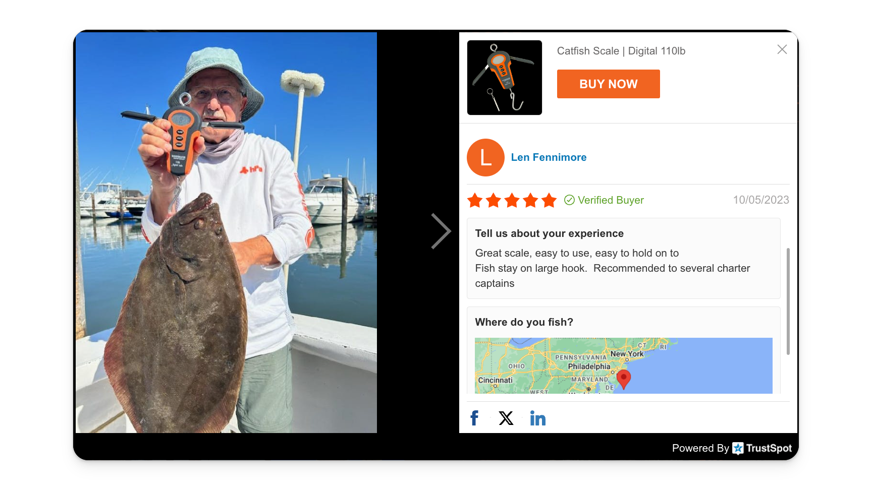
Showing visual experiences to your customers on your product pages is an excellent strategy, as it’ll allow them to imagine themselves using the product and hence recognize its value.
In Wade’s own words, “TrustSpot encapsulates visual experiences through the way real customers show how they use your product by the experiences they have with them.”
For example, if you sell fishing lures like in this example, it becomes easier to just show your customers how your product works out in the wild, as opposed to making claims about what it can do.
Aside from just images, Wade also recommends using video testimonials, as they highlight experiences in a more engaging manner through voice inflections and facial movements —- plus, they also give your lead an idea about who the product is for. (Is it really for them? Can they see themselves using it?)
Besides these two major benefits, you also end up seeing higher engagement rates because of visual experiences, as they allow your customers to view, click, and scroll something, keeping them on the site for longer.
Now that the benefits are done, you might be wondering how can you show these experiences? There are really only two ways:
- User-Generated Content (UGC) & Review Carousels: Wade recommends not putting UGC content/reviews too far down the page and instead pushing this social proof near the CTA (within the first couple of scrolls of your webpage).
For example, here’s an Exhibit A you can consider:

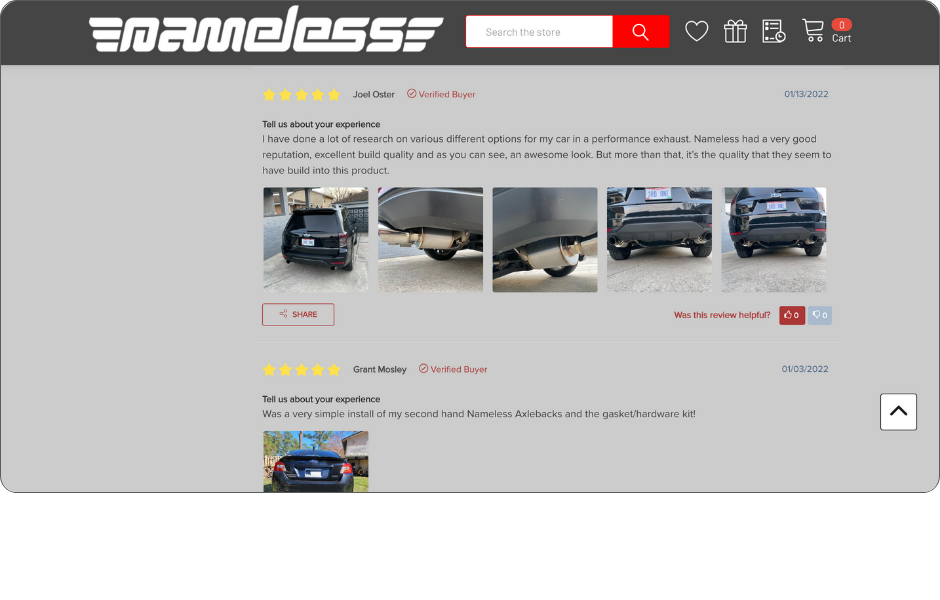
- Review Widgets Highlighting UGC: Wade also suggests highlighting text reviews that have photos and videos for context, as they’ll help reaffirm the value of your product. For reference, you can consider the example of Nameless:
Tip 2: Write accurate and comprehensive product descriptions
Accurate and comprehensive product info translates to matching product info with exact specifications (e.g., a U-shaped T-shirt can’t be promoted as a V-shaped one). It also means adding all the key product information to help customers make a sound buying decision.
In simple words: Sparse product details and mismatched information will do you no favors trust-wise (and ergo, sale-wise).
[Writer’s Note: If you wish to fill out sparse product details or update/refresh product information in bulk to keep up with all those small specifications (which can be especially necessary if you offer the same products in different colors/cuts), Describely can help you out.
Simply go to Bulk Actions in your product catalog, select your products, and click “Bulk Generate” on Describely.

You can also use these two guides to help you out:
- How to Write or Refresh eCommerce Product Descriptions Faster
- How to Write High-Quality Product Descriptions When Suppliers Give You Sparse Details]
Back to the topic, Kayla recommends also adding high-quality images and exact product specifications to your pages to showcase to customers what they could get out of it.
“If you don’t have a great photo for the product and there’s nothing on your page, or if you’re just copy-pasting your products from your current vendors, that’s not going to blend well —- in fact, it’s going to remove a lot of trust,” she says.
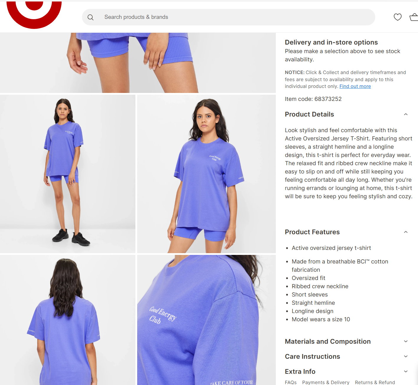
An example she gives is of Target Australia since the company really stresses on including visuals and text that accurately portray the product value.
According to Kayla, here are a few ways you can mindfully create accurate and comprehensive product information:
- Address potential buyer questions: Think about what the product will look like on the customer — is it a dress they can wear in the summer or the winter? Is the dress A-line or fit-and-flare? Does it come with pockets or not?
For example, in the reference above, you can see Target writes the product size the model is wearing to ensure customers have an accurate understanding of what the jersey t-shirt will look like on them.
- Craft product descriptions that resonate: This translates to adding specific details about the product that shows the reader how and where to wear it (and also helps build connections with buyers).
- Think in the shoes of the shopper: For example, does your customer want to look elegant on a night out? Or are they opting for comfort while taking their kids to the zoo? Once your descriptions tell your buyers exactly what they can achieve, it can help them add the product more easily to their cart.
Tip 3: Constantly collect new experiences
Wade says reviews and experiences differ drastically. While reviews focus on the usefulness of a product and the feelings a customer had when engaging with it, they can also lack context.
“Reviews typically focus on the functionality of a product, (they answer questions like) how did it make me feel and did it work for me; they’re really simple,” says Wade.
Experiences, on the other hand, showcase the value of the product, are more contextual, and help build trust in eCommerce product pages.
For reference, here’s an example of the difference between a review and an experience from Whiskerseeker.
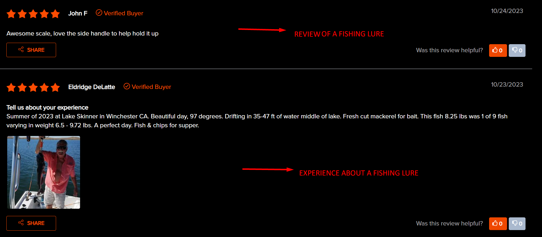
Here’s another example of a product “experience”:
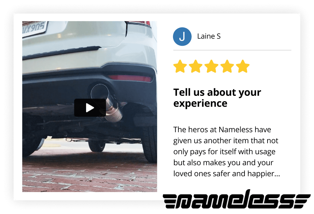
And on a funnier note, reviews like these also get categorized as an “experience” as they help show the exact value of a product:
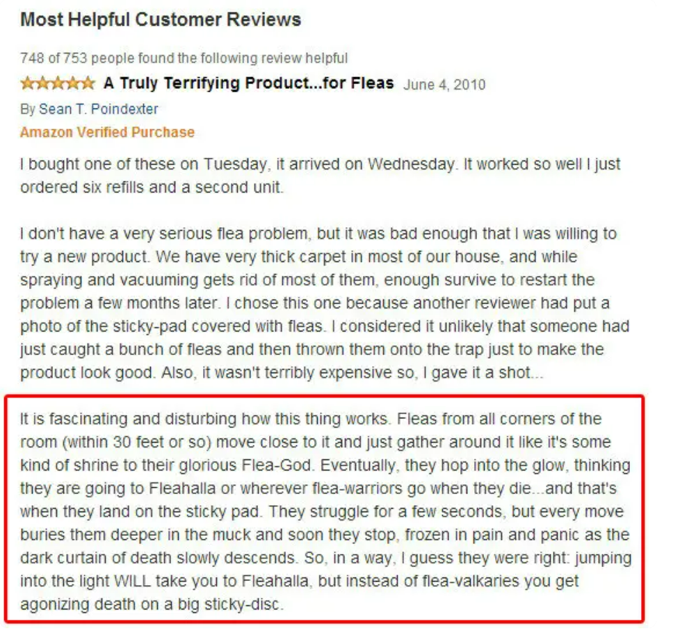
So, where to collect these experiences and how to build trust in eCommerce product pages, you ask?
Here are a few ideas you can consider:
- Post-Review Submission: Once your buyer has submitted a review about your product, follow up with them after 30 days (or after the life of your product has ended) with a more detailed survey to get more context and content from them.
- Dedicated Experience Page: This is something like a review page, but it’s full of visual experiences published by customers on a seller’s website. For reference, consider this example of Gunner shared by Wade:
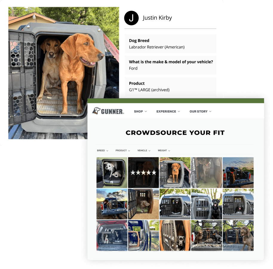
- Checkout Survey: These are helpful for repeat buyers who can tell you about their experiences with past purchases and provide insights on the site flow too.
Tip 4: Maintain brand consistency
Having the same tone, language, and grammar across your website helps build an image of professionalism and trustworthiness in the eyes of your customers, and also assures them about what to expect from your brand.
Kayla shared a few different ways to build and maintain brand consistency:
- Visual Cohesion: Are you using the same color scheme and style guide throughout your website? Will the colors help build trust in your eCommerce site? For example, if you consider brands like Apple and Target, you know what visual tones and colors (and even shades) to expect from them.
Over a period of time, these colors can become synonymous with your brand and help buyers instantly recognize you from anywhere.
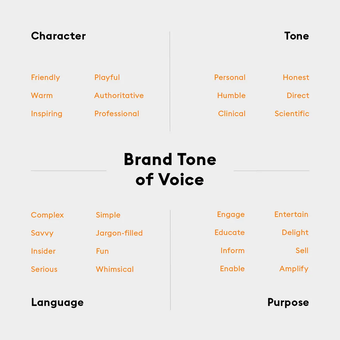
- Tone Alignment: Your brand tone (be it on your website, social channels, or customer service interactions) should align. Think about the image you want to portray in front of your customers —- friendly, professional, formal, etc. —- and create a tone around it.
Using the same examples as above, we realize Apple has a more professional tone, whereas Target has a more friendlier vibe. Kayla also recommends evaluating the industry you’re in and then deciding on a tone (e.g., the fashion industry calls for a more friendly and environmental tone).
- Reliability Impact: Think of your product pages cohesively —- from the specific details about use cases you include to the tone, design, elements (e.g., eCommerce trust badges), and other things you add to your site —- combined, these things can help customers build trust in eCommerce product pages.
As far as product pages go, Kayla stresses on adding a really great CTA (call to action) next to all the content you show/write. She also suggests:
- Refreshing review content on your website, ideally every six months (or optimizing your product pages near your big sales and seasonal events).
- Using style and tone guides you can come back to use.
- Leveraging a tool like Describely to maintain brand consistency (Describely allows you to create AI rule sets and define your custom tone, description length preference, content format, language, description instruction, etc.).
Tip 5: Use a checklist to your advantage
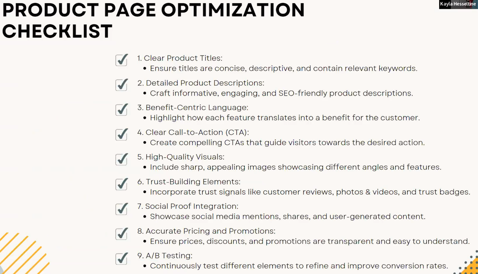
Last but not least, you can also leverage the product page optimization checklist shared by Wade and Kayla in the webinar and see if you can tick all the boxes near the holiday season.
Next steps: Watch the on-demand webinar
While we hope you found this piece helpful, the webinar goes into more depth about each individual topic and even answers your burning questions in the Q&A section.
If you’re tasked with the responsibility of writing product descriptions this holiday season (or if you just wish to boost trust on your product pages), it’s definitely worth the watch.
To access the insights of Kayla and Wade, check out our on-demand webinar: How to power up your product pages to drive more sales this holiday season (leveraging trust and AI).


